It’s been four weeks, and we are three teardowns in and we are starting to realize that landing pages across industries are quite bad.
The week before last, we took a look at a Personal Injury Attorney landing page and learned (1) that they pay an insanely high CPC on Google ($200+) and (2) that they use awful landing pages with waaaay too many CTAs (9+ in the first fold alone  )
)
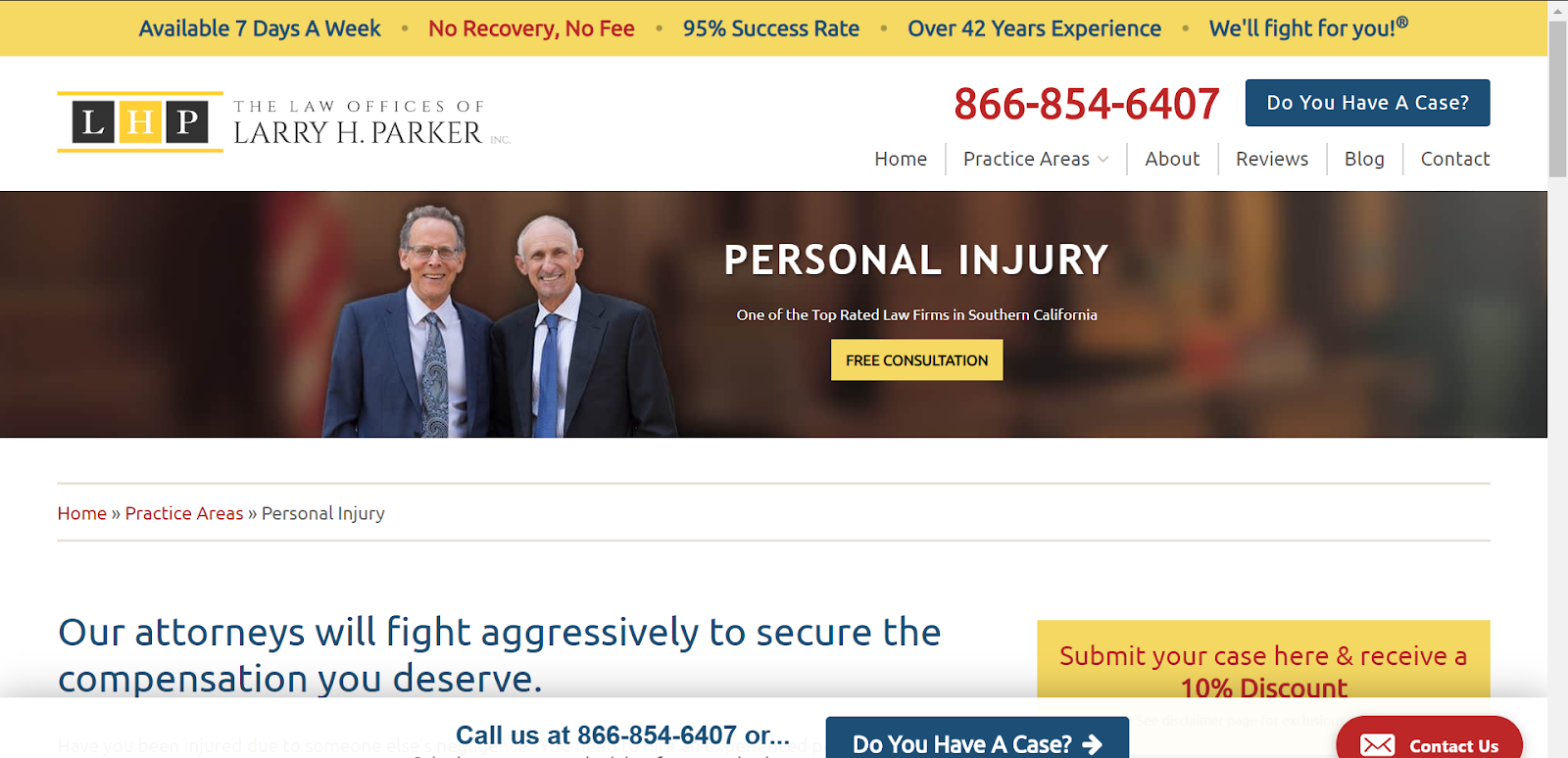
(Full teardown over here: https://hellotars.com/blog/conversational-landing-page-teardown-personal-injury-lawyer/)
Last week, we looked at a landing page from the co-working space industry which actually wasn’t too bad. The desktop version addressed a lot of the issues which we had spoken about in the previous teardown, but their mobile version canceled out all of those gains. 
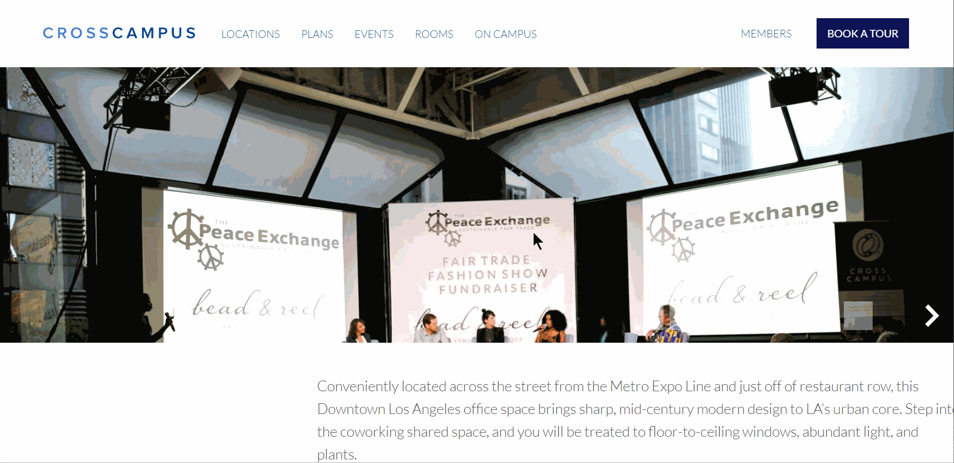
(Full teardown over here: https://hellotars.com/blog/conversational-landing-page-co-working/)
Finally, this week, we took a look at a landing page from the small business lending space and well, it was awful. If my handy CPC tool is to be believed, American Capital Group paid almost $40 for my click and they showed me a god awful landing page which had, among other problems, a grammatical error!! 
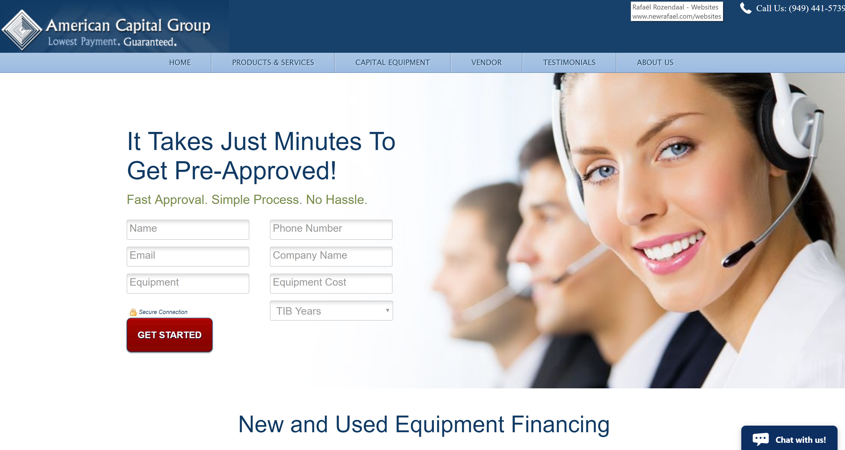
(Full teardown over here: https://hellotars.com/blog/cro-loans-landing-page/ )
Anyways, as fun as it is for us to dissect bad landing pages, we want to get the Tars community’s take on this content. What do you think about our critiques? What can we do to improve? And most importantly we’d love to hear what you guys think of the landing pages?
Let us know in the thread 