Hi everyone,
I think there is an UX issue with the Photo/File upload gambit.
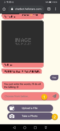
Please see the attached the first photo is the initial screen where the user is asked to take an action. The user clicks either Upload a File or Take a Photo. (Step 1 and 2 )
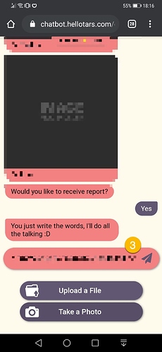
Second photo shows the screen after the user has uploaded a file or took a photo.
In my opinion once the user took one of the actions the next step should be underneath the Upload a File / Take a Photo buttons.
Currently in order to upload the photo the user needs to go one “level” up and click the Paperplane(Step 3)
This was my first time using the photo upload gambit and while testing I took me a while that I had the click the arrow in the previous step.
So my suggestion is once the file/photo is uploaded
Either,
Animate the paperplane so the user realises that he needs to click on it
Show a “complete the upload” button underneath Upload a File Take Photo buttons

